
Your Menu Is a Branding Asset — Here's How to Design It Like One
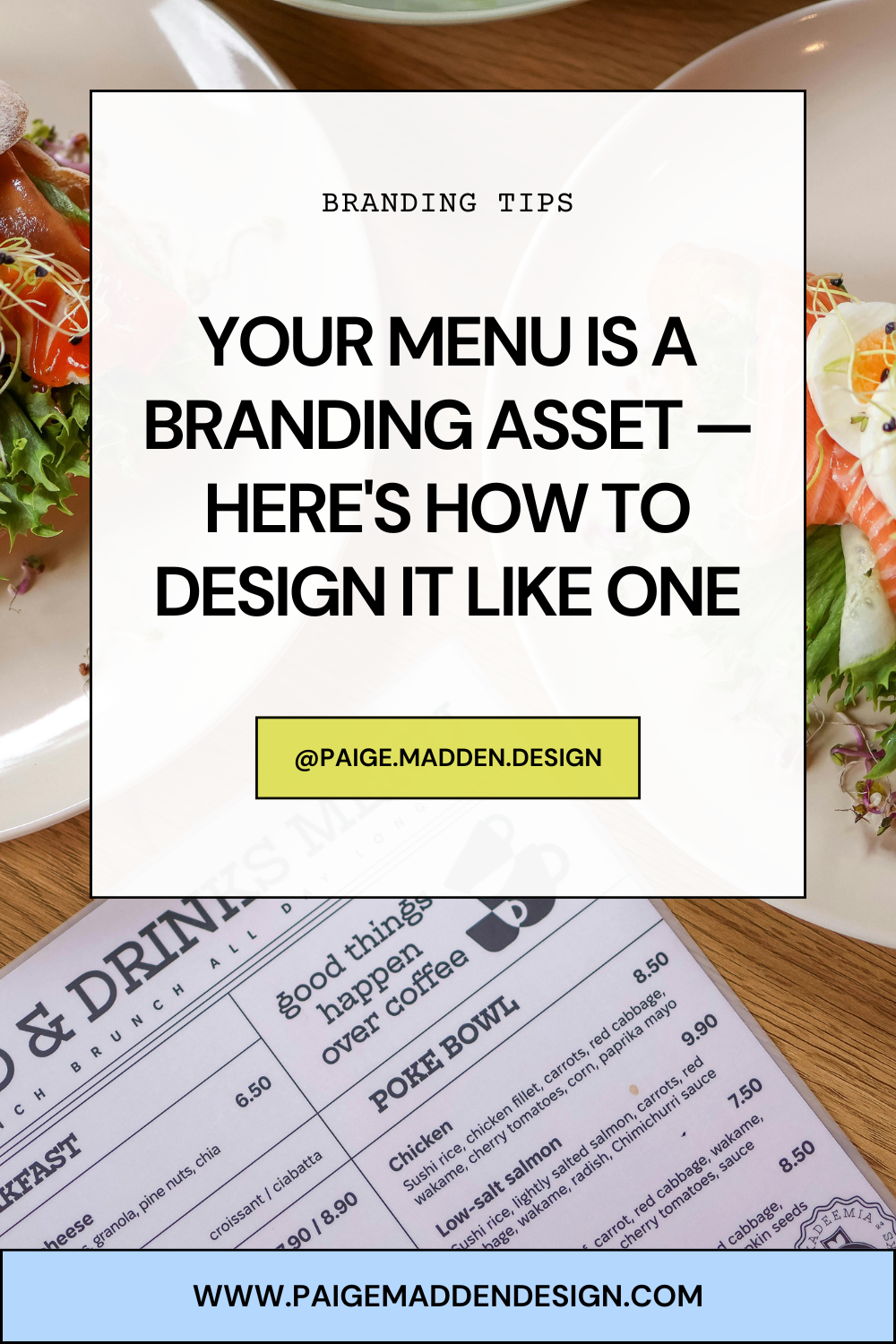
Walk into any restaurant that gets branding right, and the menu doesn't feel like a laminated sheet someone printed at Kinkos at 11pm before opening day. It feels like an extension of the room — the same confidence as the lighting, the same intention as the plating. And before a single dish arrives at the table, that menu has already done real work on your guest.
Most restaurant owners pour money into their space, their chef, their social presence, and then hand guests a document that undoes all of it. That disconnect is expensive. Not just in lost sales — in lost identity. Your menu is often the longest uninterrupted moment a guest spends with your brand in their hands. It deserves to be designed like the asset it is.
This is a guide for restaurant, bar, and hotel owners who are ready to stop treating the menu as an afterthought and start treating it as one of the most powerful branding tools in the building.
Why Most Restaurants Treat Their Menu as an Afterthought — and What That Costs Them
Here's how most menus get made: someone types up the dishes in a Word doc, picks a font that feels vaguely upscale, maybe drops in a logo, and sends it to the printer. Or they buy a Canva template and call it done. The result is a menu that looks like a menu — generic, forgettable, disconnected from everything else the brand is trying to say.
This happens because menus are often built under pressure (opening week, a seasonal update, a price change) and by whoever happens to have the time. They're treated as operational documents rather than brand communications.
What does that cost? More than most owners realize. Research consistently shows that a well-designed menu can increase average check size. Cornell University's Center for Hospitality Research has found that strategic menu engineering — including visual design — meaningfully influences guest ordering behavior. Beyond the immediate transaction, a poorly designed menu signals something to your guest: that the details don't matter here. And if the details don't matter on the menu, do they matter in the kitchen?
Your menu shapes perception before the food arrives. It's your brand making a promise. Design it accordingly.
Typography: How Font Choice Communicates Personality Before a Word Is Read
A guest picks up your menu and starts reading — but their brain has already formed an impression before they've processed a single dish name. That impression comes from your typography.
Fonts carry enormous emotional weight. A serif typeface like Garamond or Playfair Display signals heritage, refinement, and tradition. It says: we've been doing this for a while and we know what we're doing. A clean, modern sans-serif like Neue Haas Grotesk or Aktiv Grotesk says: we're precise, contemporary, and confident. A hand-lettered script says: warmth, craft, personality. A bold, condensed display font says: energy, attitude, casual swagger.
None of these choices are right or wrong — they're only right or wrong in context. The question is whether your font choices align with your brand's actual personality. A farm-to-table restaurant with weathered wood walls and handwritten chalkboards loses credibility when its menu is set in a clinical, corporate sans-serif. Conversely, a sleek cocktail bar undermines its sophistication with an overworked script that's hard to read at low light.
Practical rules for restaurant menu design branding through type: use no more than two typefaces (one for headers, one for body), ensure body copy is readable at arm's length in your actual lighting conditions, and never prioritize style over legibility. A beautiful font your guests can't read in candlelight is a liability, not an asset.
Visual Hierarchy: How Layout Guides Decisions and Steers Guests Toward High-Margin Items
Where the eye goes first on a page is not random — it's the result of design decisions. Visual hierarchy is the art of guiding attention deliberately, and on a menu, that means guiding your guests toward the items that are best for your business and best represent your brand.
The most valuable real estate on any menu page is the upper-right quadrant and anywhere a design element draws the eye — a box, a rule, white space, a slightly larger type size. Menu engineers call these "sweet spots," and they're where your signature dishes or highest-margin items belong.
But hierarchy isn't just about highlighting individual items. It's about structuring the entire reading experience. Sections should have a clear visual weight and order. Subsections should feel subordinate without disappearing. Descriptions should support the dish name, not compete with it. Pricing should be present but not dominant — the moment your guest is scanning a column of right-aligned prices, they're making a spreadsheet decision, not a desire decision. Set prices in-line at the end of descriptions, rather than in a separate column, to keep attention on the food.
White space is one of the most underused tools in restaurant menu design. Crowding every inch of the page signals abundance but creates anxiety. Space signals confidence. It says: every item here was chosen deliberately. That perception has value.
Color, Paper Stock, and Texture as Brand Signals
Open a menu printed on thin, glossy paper and something registers immediately — usually something unflattering. Now open one printed on a heavy, uncoated stock with a soft matte finish. The tactile experience begins before you've read a word, and it tells you exactly what kind of place this is.
Color and materials are brand language. They communicate before the rational brain catches up. Your color palette should pull from your broader brand identity — the same palette used in your signage, your website, your packaging. A menu that shares no color relationship with anything else in your visual system looks like it was designed in a vacuum, because it was.
For color specifically: consider how your palette looks in your actual environment. A rich burgundy that looks luxurious on screen might read as muddy under warm incandescent lighting. Test your printed menu in your actual space before finalizing.
Paper stock is a budget decision, yes — but it's also a brand decision. A heavy cotton or textured stock costs more and communicates more. A laminated or wipe-clean menu is practical for high-turnover environments and signals that practicality honestly. What you don't want is a mismatch: a fine dining restaurant using cheap laminated menus, or a casual neighborhood spot investing in bound leather booklets that feel out of place and pretentious.
Binding, finish, inserts, size and proportion — all of these are choices that compound into a total sensory impression. Every one of them is part of your brand.
Menu Language and Tone of Voice — Copy as a Brand Tool
The way your menu is written is as much a brand decision as the way it looks. Tone of voice is one of the most underused tools in restaurant branding, and the menu is where it lives most visibly.
Consider the difference between these two descriptions of the same dish:
"Grilled salmon with lemon butter sauce and seasonal vegetables"
versus
"Wild-caught king salmon, grilled over oak, finished with brown butter, Meyer lemon, and whatever the farm dropped off this morning."
The second version is longer, yes — but it does three things the first version doesn't. It signals sourcing values. It creates sensory anticipation. And it communicates a personality: curious, confident, connected to the ingredients. That personality is your brand speaking.
Tone of voice should be consistent with everything else your brand communicates. If your Instagram is warm and playful, your menu descriptions shouldn't read like a legal document. If your brand positioning is minimalist and refined, your descriptions should be spare and precise — trusting the quality of the ingredients to speak for themselves.
Avoid the trap of filler adjectives that mean nothing: "delicious," "amazing," "incredible." These words are placeholders for specificity. Find the actual detail — the technique, the origin, the unexpected pairing — and let that do the work.
One more thing: section headers and category names are also brand copy. "Small Plates" works. "Things to Share" works differently. "Snacks" works differently still. The words you choose at every level of the menu contribute to the voice guests hear.
Photography and Illustration: When to Use Them, When Not To
Food photography is a loaded decision. Used well, it can drive ordering and build appetite. Used poorly, it can cheapen a brand faster than almost anything else.
The case for photography: casual, accessible concepts — fast casual, family dining, high-volume bars — can benefit enormously from quality food photography. When guests aren't familiar with a dish, a beautiful image reduces uncertainty and increases the likelihood of ordering. It also communicates effort and care about presentation.
The case against photography: fine dining and upscale concepts almost universally avoid food photography in menus, and for good reason. It fixes expectations in a way that works against the surprise and craft of elevated cuisine. It can also date quickly as dishes evolve and photography trends shift. In these contexts, typography and paper do the work that images would do elsewhere.
Illustration is a third option that's underused and often exactly right. A custom illustration — whether detailed pen-and-ink or loose and gestural — adds personality and uniqueness that photography rarely achieves. It also doesn't go stale the same way. A beautifully illustrated menu from five years ago still looks intentional. A dated food photo from five years ago looks like a relic.
If you use photography, invest in it properly. Phone photos, even good ones, rarely work at print resolution or communicate the quality that professional food photography can. If the budget isn't there for proper photography, illustration or type-driven design is almost always the better choice.
How Your Menu Should Relate to Your Other Brand Touchpoints
Restaurant menu design branding doesn't exist in isolation. Your menu is one document in a larger brand ecosystem that includes your website, your signage, your social presence, your packaging, your uniforms, and the physical experience of your space. When all of these things speak the same visual and verbal language, guests feel it — even if they can't articulate why. When they don't, the friction registers as something being slightly off, even if guests can't name it.
The most common disconnects: a menu that uses completely different fonts from the logo and website; a menu color palette that doesn't relate to anything else in the space; menu copy that's formal and distant when the rest of the brand is casual and warm.
Your menu should share core visual DNA with your other brand materials — the same typeface families, the same color palette, the same design sensibility. This doesn't mean everything has to look identical. It means it should clearly come from the same family.
This is also true of your digital menu. If you use a QR code that links to a plain-text PDF or a third-party ordering platform with no branding, you've handed off a major brand touchpoint to a generic interface. Where possible, ensure your digital menu carries the same design intentionality as your print menu.
Guests move between touchpoints constantly — they find you on Instagram, visit your website, walk through the door, pick up the menu. Each transition should feel like a continuation of the same story.
Practical First Steps to Audit Your Current Menu Against Your Brand
You don't need to redesign everything tomorrow. But you do need to know where you stand. Here's how to run a fast, honest audit of your current menu.
Step one: The stranger test. Hand your menu to someone who has never been to your restaurant and ask them to describe the kind of place it suggests — price point, vibe, audience. Then compare that answer to what you believe your brand to be. Any gap between those two things is a design problem.
Step two: The touchpoint comparison. Print out or pull up your menu alongside your website homepage and your most recent social posts. Ask: do these look like they came from the same brand? Do they use the same colors, the same typefaces, the same general aesthetic? If not, identify the specific points of disconnection.
Step three: Read it aloud. Read your menu descriptions out loud. Does the language sound like you? Does it sound like someone you'd want to have a conversation with? Does it make the food sound worth ordering? If anything sounds awkward, generic, or out of character, flag it.
Step four: Map your high-margin items. Identify your top three to five highest-margin dishes. Now look at where they live on your menu. Are they in a visual sweet spot? Do they have a description? Are they distinguished in any way from the surrounding items? If not, you're leaving money on the table — literally.
These four steps won't replace a full brand and menu design process, but they'll tell you exactly what kind of work needs to happen.
The Menu Is Never Just the Menu
Every design decision on your menu — the fonts, the layout, the paper, the words, the photos or lack of them — is a statement about what your restaurant values and who it's for. Guests read all of it, consciously and not. The question is whether what they're reading is what you actually want to say.
The best menus feel inevitable. They feel like they couldn't have come from any other restaurant, because they couldn't. That level of intentionality doesn't happen by accident, and it doesn't happen when a menu is built under pressure with whatever's available. It happens when a restaurant treats its menu the way it treats its best dishes — with craft, with purpose, and with the guest's experience at the center of every decision.
That's what it means to design a menu like a branding asset. And the restaurants that do it well? Their guests notice — even when they don't know why.
Ready to design a menu that works as hard as your kitchen does?
Book a Discovery Call and let's talk about what your menu could be doing for your brand.
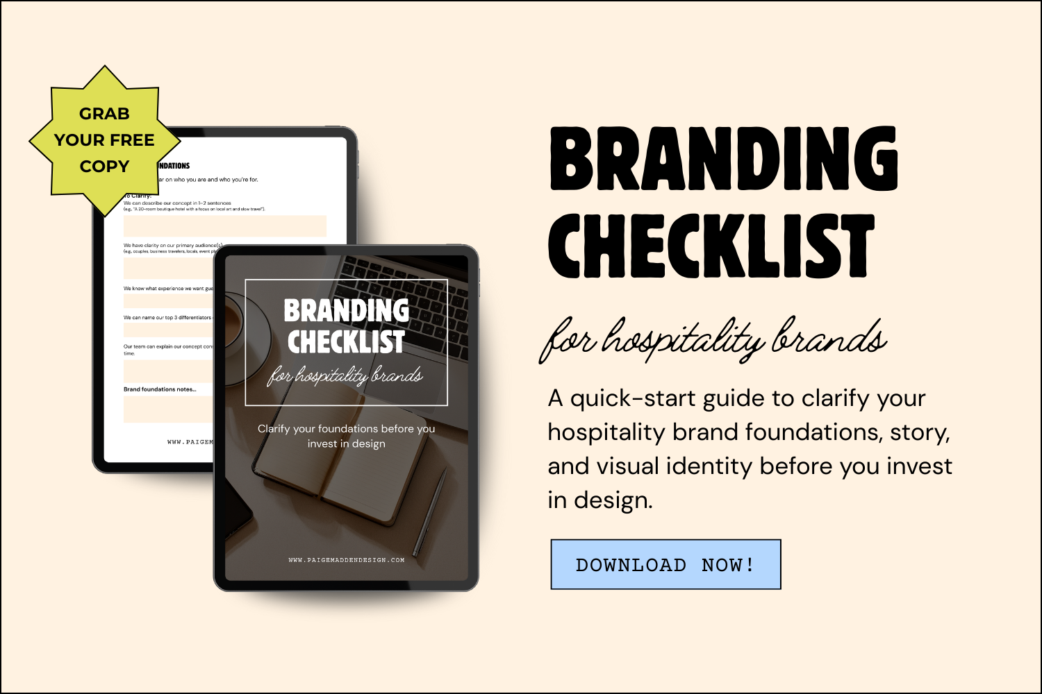
Three ways to work with Paige Madden design, hospitality brand & Squarespace designer:
Whether you're opening a new concept, refreshing an existing restaurant group, or tackling a single design project that keeps getting pushed aside, there's a package built for where you are right now. Every engagement starts with a 30-minute discovery call — no pressure, no hard sell.
Custom Branding — from $1,250 · 4–6 weeks
Custom Squarespace Website — from $3,250 · 4–6 weeks
Design Intensive Days — from $55/hour · 1 day to 1 week